Knowing how to choose between cool vs warm tones during the editing phase can give a completely different mood to photography. For this reason, it is interesting to deepen this topic. Among all the elements that make up an image, colors occupy a prominent position.
When we talk about tones in photography, we refer to the subjective perception of colors. Some are more attracted to cool colors, others to warm ones.
To make things easier for you, you can think of varying color tones like when you apply a filter on Instagram. With a few adjustments of brightness, saturation, and temperature you can get unique and interesting results. The difference is that a filter does it automatically, while today I would like to try to explain to you how to change the tones yourself to your liking.
Shall we begin?

Cool tones vs warm tones: where to start?
To make everything clearer, here is a list of the topics we are going to talk about:
- Cold tones and warm tones an introduction
- The shortcut: rely on filters and presets
- Introduction to tonal curves
- Examples of editing with tutorials and the final result
I’ll show you the key principles, but be aware that we will only touch the surface. If you are interested in learning more about this topic, stay tuned and don’t miss all the new guides on it!
1. An introduction to cool and warm tones in photography
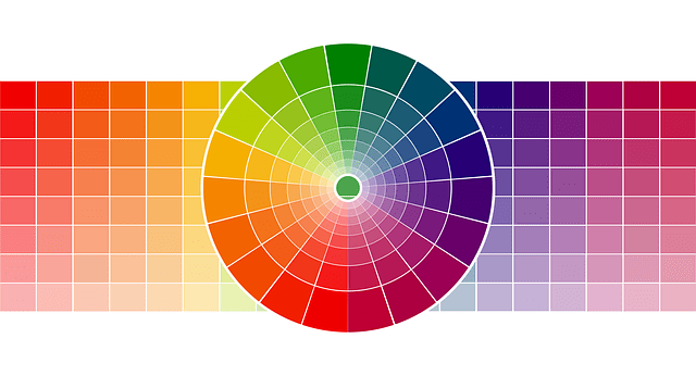
Let’s start by clarifying the differences between the two a bit. Cool tones are represented by cold shades, therefore blue, green, and so on…
The warm tones are represented by the warm shades, therefore yellow, red, and all the resulting shades. Take in mind that for example, purple can tend to be both hot and cold, depending on which colors it is mixed with.
The main differences are quite evident. In the case of shades, however, you must know that neighboring colors, in a certain sense, influence each other.
Some photographers take advantage of the contrast between the shades to give greater strength to their images. The important thing is to use complementary colors that, put simply, go well together. You can learn a lot more about it by studying the theory of color.
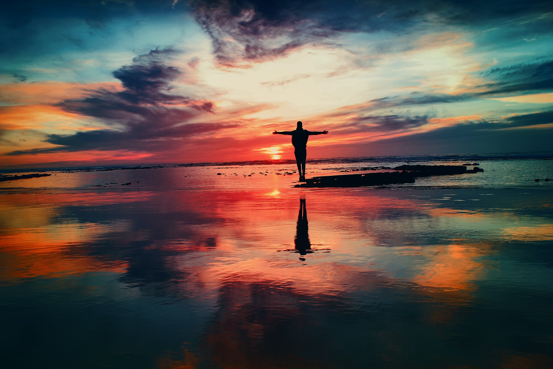
It all boils down to the stylistic choice you want to give to your photography. You can choose to use only warm tones or just cold tones, or my personal favorite, contrast them.
Another possible choice to use only one of your shades may also be due to the atmospheric conditions portrayed. For example, a sunset requires warmer hues than a photo taken in broad daylight or during a thunderstorm.
2. The shortcut: rely on filters and presets

If you are looking to improve your photographic skills, but you are not going to waste too much time on it, then relying on filters or presets may be the solution you are looking for.
There is nothing wrong with opting for this quick and efficient solution. Sometimes it happens to me to use existing filters on my images, especially when I have little time available. The difference is that I don’t just apply the filter, I modify it to reflect the idea I have in mind.
That the filters are comfortable and easy to use is impossible to deny. My advice, however, is to try to modify them. This allows you to see the impact that small adjustments can have on a photo.
Use them as a starting point for your edit. You can use filters from Instagram, Snapseed, VSCO, and a thousand other applications. Just remember to adapt them to your image. Remember: we want to achieve the most natural result possible so stay away from the glitter and fake vintage film effects.
If you use Lightroom you can even download or buy presets, which are nothing more than a little more elaborate filters. The final result does not change.
3. Introduction to tonal curves

You can ask any photographer and each of them will tell you that you either love tonal adjustment curves or hate them, but they are certainly your best ally too.
Learning to use them takes some practice. But if you want to completely change the mood of an image, they are the tool that more than any other can do it.
Through the curves you can change the whole light spectrum (low, medium, and high tones): you can control the exposure, the shadows, the highlights, and of course, the colors.
You can find this tool in photo editors like Lightroom and Photoshop, but a simplified version is now present in many editing apps for mobile. To learn how to juggle the various levels you could just start with the mobile apps.
The examples that I will show you in the next paragraph were made with Snapseed. If you are a reader of my blog, you will know that this is not the first time that I have mentioned this great app.
How to use tonal curves (Snapseed version)
Once you open the curves tool within the application, you will have your image in front of you and overlying a graph with an oblique line and a histogram.
The symbol following the “X” is the one we will focus on. If you click on it, you will be shown 5 different curve possibilities:
- RGB: this is the curve that controls all the elements a bit. You can consider it the same as the “calibrate” section. From here you can make slightly more specific changes to each area (shadows, highlights, or the whole)
- Red: by modifying this curve you will add or remove the warm tones.
- Blue: as for red, only in this case it refers to cold tones
- Green: same concept as the previous ones except that it refers to green tones.
- Brightness: Change the brightness of each area.
You may be wondering: are green tones not part of blue, that is, cold tones? Yes, but greens, like purples, are shades that can affect a lot when combined with warm tones or cool tones. For this, they have a dedicated section.
By moving the line you can modify all these elements and experiment with more style combinations.
Snapseed is great for learning to edit cool and warm tones because it also has a section with filters where you can not only apply them with one click, but you can also see the final position of the curves and learn what corresponds to certain positions accordingly.
4. Editing the tones with Snapseed: an example
Before we say goodbye I would like to show you a couple of edits that I have made with Snapseed to show you the potential of cool and warm tones. They are very simple edits, but ideal for making you understand the potential of the tone curve.
BEFORE

AFTER


The potential is almost unlimited, but as always a little experience and a lot of practice are required. Over time you will learn to distinguish at a glance all the shades used to obtain the final image in front of you.
Hope you enjoyed this getting started guide! See you next time!


